

Three mobile-first project dashboard patterns cover nearly every student and small-team scenario: the Today view (single-focus, best for exam weeks), the Sprint board (Kanban-style, best for group projects), and the Timeline/Calendar view (best for deadline-heavy research). Every pattern shares four core elements: a quick-add capture flow, due-date visibility, file attachments, and a clear start/stop action. Jump to the Optio setup section below to build any of these in under ten minutes.
Core elements every pattern needs:
- Quick add: capture a task in two taps and categorize later
- Due-date badges: visible on every card without opening it
- Attachments shortcut: files and notes linked directly to tasks
- Start/stop action: one prominent button, not buried in a menu
Pro Tip: Start with the Today view for your first week. It forces you to name one top priority per day, which is the fastest way to build the habit before adding more structure.
Key Takeaways
The most effective mobile project dashboard for students uses one focused pattern per project type, built around a quick-add flow, visible due dates, and a single primary action.
| Point | Details |
|---|---|
| Three core patterns | Today view, Sprint board, and Timeline each answer one specific question for students. |
| Must-have components | Quick add, drag-and-drop board, visual calendar, text-plus-color status labels, and push reminders. |
| Mobile design rule | One large primary action per screen; always pair color with a text label for accessibility. |
| Avoid over-engineering | A dashboard that tries to answer every question at once usually answers none of them well. |
| Optiostation | Provides mobile-first templates for all three patterns with CSV import and calendar sync built in. |
Table of Contents
- What do project dashboard examples look like for students?
- What components does every student project dashboard need?
- Mobile-first design rules your dashboard must follow
- How to build these three examples in Optio
- Starter templates and wireframes you can copy
- Why simplicity beats features in student dashboards
- Optio gives students a mobile-first dashboard without the setup overhead
- Sources
What do project dashboard examples look like for students?
Example 1: Today / single-focus view
The Today view is the leanest of the three project dashboard examples, and it earns that simplicity. The layout is a single screen: a bold “Today” header at the top, one large Start button tied to your highest-priority task, and three to five priority cards stacked below it. Recent items surface at the top of any picker so you never scroll to find yesterday’s work.
Key components:
- Priority pin: marks the single task that gets the Start button
- Quick add: one tap to log a task and fill details later
- Focus timer: a session of typical lengths attached to the active card
- Due-time badge: shows the deadline on the card face, no tap needed
- Attachments shortcut: lecture notes or a PDF linked to the task
A concrete scenario: during final exam week, you create one project per subject. Each morning you pin one study session as the top task, hit Start, and the timer runs. When the session ends, you mark it Done and the next card rises. No navigation, no decision fatigue.
Koder keeping the Home/Today view focused so the app answers “What is the most important thing I need to do right now?” immediately. That single design principle is what separates a useful student dashboard from a cluttered one.
Pro Tip: Use quick add to dump every task that crosses your mind, then spend two minutes each evening assigning due dates. Empty-state abandonment happens when adding a task feels like a form to fill out.
Example 2: Sprint board for group projects
A Sprint board maps tasks across three lanes: To Do, Doing, Done. On mobile, you have two layout options: stacked lanes (scroll vertically through each column) or a horizontal carousel (swipe between columns). Stacked lanes work better for teams of two to three people where you need all lanes visible at once. The carousel suits larger groups where each person mostly works within one lane at a time.
Interaction details that matter on mobile:
- Drag-and-drop affordance: a long-press handle on each card signals it is draggable
- Quick assignee tag: one tap to assign a card to a teammate
- Inline comments: threaded notes attached to the card, not a separate chat
- File attachments: shared docs linked at the card level
Accessibility is non-negotiable here. Never rely on color alone to show status. A card that is only “green = done” fails anyone with color-vision differences and fails everyone in bright sunlight. Pair every color with a text label: “In Progress,” “Blocked,” “Done.” This is a hard rule, not a suggestion.
Magnifi’s student-focused platform shows that centralizing task boards, deadlines, and attached notes into one board reduces context switching and makes group projects easier to manage. Keeping everything in one place means your teammate does not have to ask where the latest draft lives.

Hostinger’s task manager tutorial identifies a Kanban-style task board as one of three must-have pages for any task manager MVP, alongside a dashboard overview and a focus timer. That trio maps directly to the three patterns in this article.
Pro Tip: Limit the Doing lane to a small number of cards per person. More than that and the board stops reflecting reality; it just becomes a second To Do list.
Example 3: Timeline / Calendar view for deadline awareness
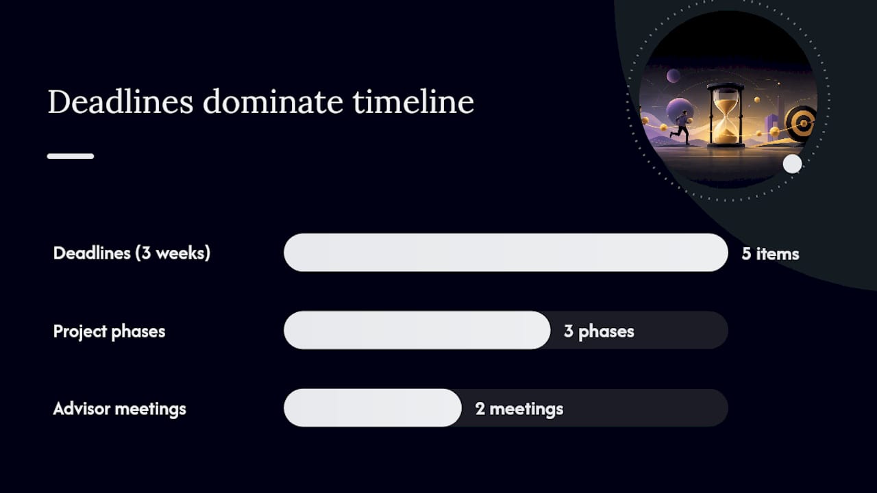
The Timeline view solves one specific problem: you know you have five deadlines in three weeks, but you cannot see how they stack. A compact week strip at the top shows the full seven days. Tap any day to expand it into a block schedule with time slots. Tap a slot to schedule a task with a quick duration preset: 25 minutes, 50 minutes, or custom.
Layout and interaction notes:
- Week strip: always visible, color-coded by project
- Expandable day view: tap to see time blocks for that day
- Tap-to-schedule: pick a slot, assign a task, set duration in one flow
- Calendar sync: pull in course deadlines or shared project milestones automatically
One usability warning: do not force a date on every task. Tasks without natural deadlines should stay undated until you are ready to schedule them. Forcing dates creates a calendar full of arbitrary due dates that you start ignoring, which defeats the whole purpose.
PlanIt’s open-source React Native app demonstrates drag-to-schedule calendar interactions and task-duration sync between calendar blocks and task cards, a practical reference for how this pattern works on a real mobile screen.
A research project scenario: you have three phases (literature review, draft, revisions) and two advisor meetings. Each phase becomes a milestone on the timeline. Advisor meetings sync from your calendar. Maintenance tasks like “back up files” and “sync shared folder” appear as explicit milestones rather than invisible work that derails your schedule.
Pro Tip: Block time for sync and review tasks the same way you block writing time. Hidden maintenance work is the most common reason student timelines fall apart.
What components does every student project dashboard need?
A solid student project dashboard includes these components. Mark the must-haves before you build anything:
Must-have (MVP):
- Quick add (capture in two taps and categorize later)
- Drag-and-drop task board
- Visual calendar or timeline
- Status labels with text AND color
- Push reminders for due dates
Useful but optional:
- Start/stop focus timer
- Centralized document area
- CSV import for bulk task creation
YOTTA’s student project planning approach demonstrates the value of keeping tasks and documents together in one place, so you are not switching between a task app and a file folder mid-session.
Context switching is one of the biggest productivity costs for students. A unified board that keeps task progress and files together reduces that cognitive load and improves consistency across a project’s lifecycle.
Mobile-first design rules your dashboard must follow
Koder.ai’s guidance on mobile app design is direct: design for one primary audience, keep the Home view focused, and answer “What is the most important thing right now?” before anything else. That principle shapes every rule below.
Device-first rules:
- Tap targets: minimum 44×44 points (Apple’s standard); larger for primary actions
- Single large primary action per screen (Start, Complete, Add)
- Recent items at the top of every picker, not alphabetical
- No more than two navigation levels deep
Accessibility:
- Always pair color with a text label for status
- High contrast between text and background
- Fonts legible at arm’s length in varying light
- One-handed use: primary actions reachable with a thumb
A Medium UX case study on productivity apps warns against splitting a dashboard into too many chart-heavy overview screens. Students do not need a pie chart of their task completion rate. They need to know what to do next.
Pro Tip: Test your dashboard in direct sunlight. If you cannot read the status labels outside, your contrast is too low. Fix it before you rely on it during a commute.
How to build these three examples in Optio
Today view setup
- Open Optio and tap New Project.
- Name it “Today” and set the view to Single Focus.
- Add three to five tasks with due-time badges.
- Pin your top task using the priority flag.
- Tap Start to launch a focus session.
Sprint board setup
- Create a new project and select Board View.
- Add three lanes: To Do, Doing, Done.
- Invite teammates and assign each card an owner.
- Enable inline comments and file attachments in project settings.
- Set lane limits (two cards max in Doing per person).
Timeline setup
- Create a project and select Timeline View.
- Add milestones for each project phase.
- Tap Calendar Sync to import course deadlines.
- Schedule tasks by tapping a time slot and selecting a duration preset.
- Add maintenance milestones (sync, review, backup) as explicit tasks.
Common setup mistakes to avoid:
- Forcing due dates on every task before you know when they are due
- Over-tagging tasks with five labels when one is enough
- Skipping the quick-add flow and going straight to full task forms
- Ignoring maintenance tasks in the timeline
Starter templates and wireframes you can copy
Three file formats are available to get you started without building from scratch.
Available templates:
- Mobile sketch PNGs: wireframe layouts for Today, Sprint, and Timeline views, sized for a standard phone screen
- Excel starter file: columns for task title, due date, duration, assignee, and status; ready to fill and import
- CSV import template: matches Optio’s import fields exactly (title, due_date, duration_minutes, assignee, status)
How to import to Optio:
- Download the CSV template.
- Fill in title, due date, and duration first; leave optional fields blank.
- In Optio, go to Settings > Import > CSV and upload the file.
- Map columns if prompted, then tap Import.
The Figma community task management dashboard file provides wireframe-style components and layout patterns that work as starting points for customizing your own mobile sketches. For students who want to sketch a system diagram before building, the ESS Tutor guide to system diagrams walks through the visual logic clearly.
For additional project tracker layouts beyond these three patterns, Optiostation’s template library covers more specialized use cases.
Why simplicity beats features in student dashboards
The temptation when building a project dashboard is to add more: more views, more tags, more charts. Every feature you add is a decision a student has to make before they can start working. That friction compounds fast, especially during high-pressure weeks when the dashboard needs to get out of the way.
The three patterns in this article were chosen because each one answers a single question. Today: what do I do right now? Sprint board: what is the team working on? Timeline: when does everything land? A dashboard that tries to answer all three questions on one screen usually answers none of them well.
One practical recommendation: pick the Today view as your default for the first week of any new project. It requires the least setup, forces one daily priority, and builds the habit of opening the app. Switch to the Sprint board when you add a second person. Add the Timeline only when you have three or more hard deadlines to track simultaneously.
Optio gives students a mobile-first dashboard without the setup overhead
Most task management tools are built for desktop teams and scaled down for mobile as an afterthought. Optio is the opposite: a mobile-first app built specifically for students and young professionals, with the three dashboard patterns in this article available as ready-to-import templates.
- Mobile templates: Today, Sprint, and Timeline views pre-configured for student projects
- CSV import: bulk-load tasks from a spreadsheet in under two minutes
- Calendar sync: pull in course deadlines and shared milestones automatically
- Attachment area: files and notes linked directly to tasks, not buried in a folder
Download Optio and import your first student-ready template in under five minutes. The Today view template is the fastest start: three tasks, one timer, one priority pin, ready to use.
Sources
- Koder
- How to create a task manager web app: Steps anyone can try
- Project Management for Students — Magnifi | Magnifi
- Task Management Dashboard | Figma
- PlanIt – Study Planner App (GitHub)
Recommended
- Project Dashboard Template: 7 Free Downloads for Quick Setup – Optio Station: Best Project Management App for Prioritization
- 7 Project Management Dashboard Examples for Students and Pros – Optio Station: Best Project Management App for Prioritization
- Top free project management Excel dashboard templates 2026 – Optio Station: Best Project Management App for Prioritization
- 7 Project Tracker Examples for Boosting Productivity – Optio Station: Best Project Management App for Prioritization
