

Use Optio to rebuild the one-row-per-project Excel summary as a shared dashboard, with each project listed by owner, status, next milestone, and health flag. That single view replaces the scattered spreadsheet tabs most people juggle across five or six projects. Ready-made templates give you the exact fields to start with today.
TL;DR:
- The maximum number of active projects you can realistically manage each week depends on your decision hours divided by project time demands, often between one and five.
- Prioritizing projects with numeric ranks and filtering only those within your concurrency ceiling helps prevent overcommitment and improves focus.
- Explicitly mapping dependencies and tracking hours at the task level reduces delays caused by unseen blockers and overloaded team members.
- Standardizing status labels and review routines ensure consistent, rapid assessment on mobile devices without switching tools or layouts.
- Focusing on a fixed decision limit and saying no to projects beyond your capacity is more effective than relying solely on dashboard visibility or additional tools.
Table of Contents
- How do you track multiple projects in Excel using a mobile app?
- Templates and dashboards: what to import or build first
- How many projects can you actually manage at once?
- Coordinate teams, map dependencies, and track time across projects
- Why these Excel habits translate so well to mobile
- What actually matters here (and what doesn’t)
- Try Optio: get the templates and mobile dashboards
- Sources
How do you track multiple projects in Excel using a mobile app?
Building a portfolio dashboard on your phone takes less setup than a spreadsheet, mostly because you skip the formula wrangling entirely. The goal is the same one project managers have used in Excel for years: a single master list where every project shows its status at a glance, and a review habit that keeps it honest.
Start by creating a project record for each active initiative with these key fields: owner (one name only), phase or status using a fixed set of labels, next milestone as the single next deliverable, a priority rank instead of multiple “high” tags, estimated weekly hours as your best guess of time demand, and any current blockers.

Once those fields exist on every project, filter and sort by status or priority to create a dashboard widget that behaves like a spreadsheet summary row. You want to open the app and see, in under ten seconds, which projects are healthy, which are stalled, and which need a decision this week.
If you’re migrating from an actual Excel tracker, don’t try to import everything at once. Enter your top three active projects first, get the fields right, then add the rest. A perfect system with two projects in it beats a messy one with fifteen.
Pro Tip: Set your status labels before you enter a single project. Changing label names after you’ve tagged ten projects means retagging all ten. Five minutes of planning saves an hour of cleanup.
Templates and dashboards: what to import or build first
Three templates cover almost everything a portfolio tracker needs, and each one exposes a different kind of trouble before it becomes a crisis.
- Project summary template — the one-row-per-project view, similar to what you’d build across Excel columns, showing owner, phase, and priority for every active project at once.
- Timeline overlay template — a calendar view that stacks every project’s milestones on top of each other, so you catch deadline collisions before they blow up your week.
- Single-project dashboard template — a rollup view for one project at a time, useful when you’re deep in execution mode and don’t need the portfolio noise.
The timeline overlay does the heaviest lifting. Cross-project timeline overlays and consolidated dashboards are how you spot scheduling clashes and dependency conflicts before they cause delays, rather than discovering them the week two deadlines land on the same day.
For dashboard widgets, prioritize four: a health summary (green/yellow/red across all projects), an upcoming milestones feed, an owner workload view, and a blocked-task count. That last one matters more than people expect. A project can look “on track” in every other field while three of its tasks sit blocked, quietly eating the timeline. Optiostation’s free dashboard templates for 2026 build these widgets in already, so you’re not assembling them from scratch on your phone screen.
You can also pull the timeline structure from Optiostation’s schedule templates if you want a starting layout closer to what you’re used to seeing in a spreadsheet.
How many projects can you actually manage at once?
Here’s the number that matters more than any spreadsheet formula: your concurrency ceiling. Your concurrency ceiling is the number of projects you can actively make decisions about in a week; everything above that is being monitored, not managed. Most people badly overestimate this number, then wonder why nothing moves.
A rough way to calculate it: divide your available weekly decision hours by the realistic hours each project demands from you personally. If you have six hours a week for project decisions and each project needs about two hours of your attention, your ceiling is three. A fourth project doesn’t get canceled. It gets reclassified as “monitor only” until one of the other three wraps up or a slot frees up.
Once you know your ceiling, stack-rank your active projects instead of tagging half of them “high priority.” Labeling everything urgent makes the priority tag meaningless — only one project should ever sit in the top slot at a given time.
Here’s how to put that into practice in Optio:
- Tag each project with a numeric rank, not a repeated “urgent” label.
- Filter your dashboard to show only projects at or above your concurrency ceiling as “active.”
- Set a fixed weekly slot, ten minutes is enough, to run a stop-or-continue review: does each active project still deserve its slot, or does something below the ceiling need to swap in?
Pro Tip: Treat the weekly review as non-negotiable, not optional. It’s the single habit that keeps your ceiling from quietly creeping upward until you’re “managing” nine things and actually deciding on none of them.
Coordinate teams, map dependencies, and track time across projects
Assign exactly one owner and one next action per project. Two owners on a project means zero real accountability the moment something goes wrong, and that ambiguity is the fastest way for a project to drift for weeks without anyone noticing.
- Log hours at the task level inside Optio and let them roll up to the project total, so you catch overload before a deadline forces the conversation.
- Review the owner workload widget weekly. If one person owns four active projects while everyone else owns one, that’s not balance, it’s a bottleneck waiting to happen.
- Record dependencies directly in the project record (“waiting on design sign-off from Project B”) rather than keeping that knowledge in your head.
Mapping shared dependencies explicitly, rather than viewing each project in isolation, prevents cascading blockers — a delay in one project quietly stalling two others is far easier to catch when the connection is written down somewhere your whole team can see it. A cross-project view that surfaces every open blocker, not just the ones inside a single project, turns “why is this late” into a five-second lookup instead of a Slack thread.
Why these Excel habits translate so well to mobile
The portfolio habits that work in a spreadsheet, a single shared view, standardized fields, and a fixed review cadence, work because they’re behavioral, not tool-specific. Keeping one shared view, standardizing workflow stages, limiting work in progress, and running a fixed weekly review is the same discipline whether it’s a spreadsheet or a phone screen. What changes on mobile is friction: you check status between classes or meetings instead of opening a laptop and hunting through tabs.
Standardizing status labels and stage names across every project lets you scan five projects as fast as one, because your eyes aren’t relearning a new labeling system project by project. That consistency is arguably more valuable on a phone screen than on a monitor, where you have less room to hold context.
Optiostation built its Excel-derived schedule templates and free dashboard templates around exactly this translation: take the fields and views that already work in a spreadsheet, and give them a mobile-native home.
What actually matters here (and what doesn’t)
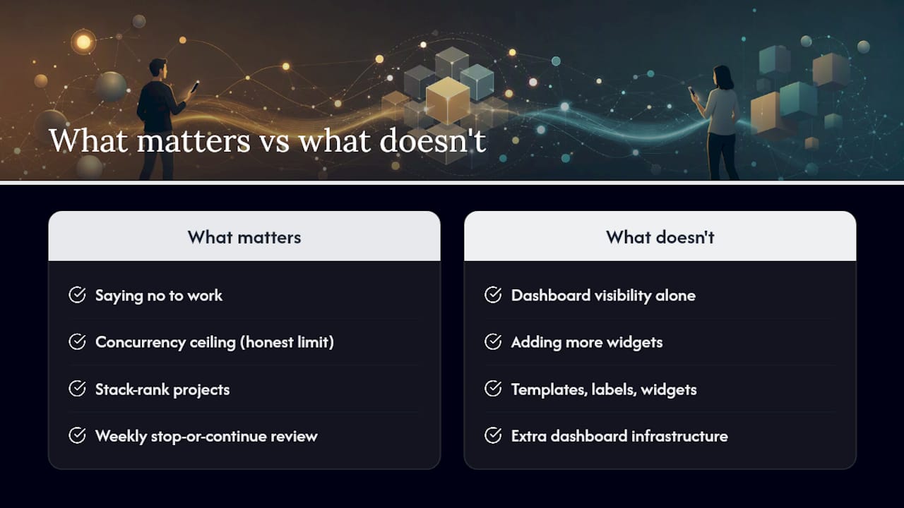
Most advice on managing multiple projects spends too much time on tooling and not enough on the one decision that actually moves the needle: saying no to something. Project portfolio management is often a subtraction problem, not an addition one. Adding another dashboard widget won’t fix a workload that already exceeds your concurrency ceiling.
The conventional wisdom on “juggling projects” treats visibility as the whole solution. It isn’t. A dashboard that shows you’re overloaded doesn’t fix the overload. The stack-rank and the weekly stop-or-continue review are what turn visibility into fewer active projects, not just clearer ones.
If you take one thing from this guide, make it the concurrency ceiling. Calculate it honestly, set your dashboard to reflect it, and treat anything above it as monitor-only until real capacity opens up. Everything else, the templates, the labels, the widgets, is just infrastructure for enforcing that one number.
Try Optio: get the templates and mobile dashboards
This mobile-first alternative to keeping multiple spreadsheet tabs open replicates the setup covered here directly on your phone: project records with owner and status fields, a shared dashboard, task-level time tracking that rolls up automatically, and reminders that flag stalled milestones before they become emergencies.
Every field described above, owner, phase, priority score, blockers, maps to something you can build in a task and project management app in the time it takes to read this sentence twice. If you’re ready to stop rebuilding the same summary tab every Sunday night, check out how Optio handles task management and get started with Optio’s task tracking to set up your first project dashboard today.
Sources
- How to Manage Multiple Projects at Once 2026 — Virtosoftware
- How to Manage Multiple Projects: The Concurrency Ceiling — ClickUp blog
- How to manage multiple projects — Atlassian
