
Managing projects in Excel feels overwhelming when you’re staring at blank cells and wondering where to start. Many students and young professionals assume creating a functional project management dashboard requires advanced spreadsheet skills or expensive software. The truth is simpler. A well-designed Excel template transforms project tracking from confusing to clear, helping you visualize deadlines, monitor progress, and stay organized without the learning curve. This guide walks you through using Excel dashboards to simplify project management and boost your productivity immediately.
Table of Contents
- Why Use An Excel Project Management Dashboard Template?
- Essential Features Of An Effective Excel Project Management Dashboard Template
- How To Customize And Use Your Excel Project Management Dashboard Template Effectively
- Common Pitfalls To Avoid When Using Excel Project Management Dashboards
- Discover Tools And Resources To Boost Your Project Management Skills
- What Is An Excel Project Management Dashboard Template?
- Can College Students Benefit From Using Excel Project Management Dashboards?
- How Can I Customize An Excel Dashboard To Fit Different Projects?
- What Common Mistakes Should I Avoid With Excel Project Dashboards?
- Where Can I Find Reliable Excel Project Management Dashboard Templates?
Key takeaways
| Point | Details |
|---|---|
| Visual clarity | Excel dashboards consolidate project data into one interface for instant progress tracking. |
| Time savings | Templates eliminate setup work so you can focus on managing tasks instead of building tools. |
| Essential features | Effective dashboards include timelines, status indicators, and resource allocation sections. |
| Customization flexibility | Dashboards adapt to projects of any size through filters and conditional formatting. |
| Skill development | Regular dashboard use strengthens project management capabilities and improves outcomes. |
Why use an Excel project management dashboard template?
Project management becomes exponentially easier when you can see everything in one place. Excel dashboards help visualize complex project data simply and effectively, transforming rows of tasks and dates into meaningful visual representations. Instead of scrolling through endless spreadsheet tabs hunting for deadline information, you get instant clarity on what needs attention now.
The flexibility advantage matters especially for students and young professionals just building their project management toolkit. You don’t need expensive software subscriptions or IT department approval. Excel runs on virtually every computer, and templates provide structure without restricting your ability to adapt. Whether you’re coordinating a group assignment, planning an event, or managing client deliverables, the same core dashboard framework applies.
Starting with a template saves hours of formatting work and prevents common setup mistakes. Consider these immediate benefits:
- Centralized tracking keeps all project information accessible in seconds
- Visual elements like charts and color coding communicate status faster than text
- Formulas automatically calculate completion percentages and highlight overdue items
- Shared dashboards improve team coordination and accountability
- Regular updates create a reliable project history for future reference
Dashboards reduce mental load by externalizing project complexity. Instead of trying to remember every deadline and dependency, you offload that cognitive work to a visual system. This frees your brain to focus on strategic decisions and problem solving rather than administrative tracking.
Using free project management Excel templates gives you professional-grade organization tools without financial barriers, making sophisticated project tracking accessible regardless of budget constraints.
The learning curve for Excel dashboards is surprisingly gentle. Basic templates require only fundamental spreadsheet skills like data entry and cell formatting. As your comfort grows, you can incorporate advanced features like pivot tables and macros, but simple dashboards deliver tremendous value from day one.
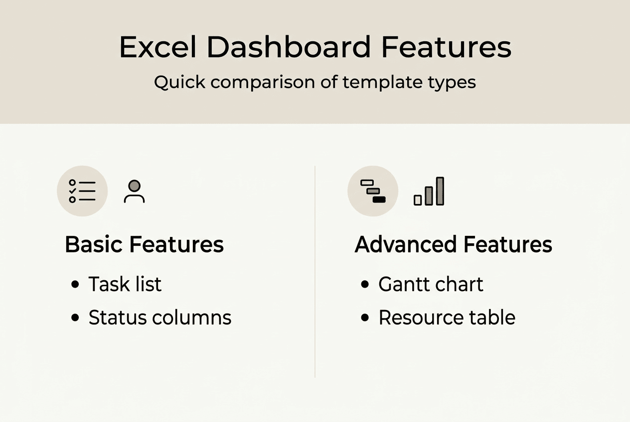
Essential features of an effective Excel project management dashboard template
Not all dashboard templates deliver equal value. The best ones include specific components that transform raw project data into actionable insights. Understanding these essential features helps you evaluate templates and build dashboards that actually improve your workflow.
Gantt charts stand as the cornerstone visualization for project timelines. These horizontal bar charts display tasks along a calendar, showing start dates, durations, and dependencies at a glance. You immediately see which activities run simultaneously and identify potential scheduling conflicts before they derail your project.

Pro Tip: Color code your Gantt chart bars by project phase or team member to add another dimension of information without cluttering the visual space.
Status indicators provide instant health checks on task progress. Simple systems work best:
- Green highlights for completed tasks
- Yellow for in progress activities
- Red for overdue or blocked items
- Gray for tasks not yet started
This color language lets anyone understand project status in seconds, even without reading detailed descriptions. Key dashboard elements include Gantt charts, task status indicators, and resource tracking tables that work together to paint a complete picture.
Resource allocation sections answer the critical question of who does what. A simple table listing tasks alongside assigned team members prevents confusion about responsibilities. For solo projects, this section tracks which tasks require specific tools, materials, or information before you can proceed.
Milestone markers identify major project checkpoints and deliverables. These anchor points help you gauge overall progress beyond individual task completion. Hitting milestones on schedule indicates healthy project momentum, while missed milestones signal the need for intervention.
Here’s a comparison of dashboard complexity levels:
| Feature | Basic Dashboard | Intermediate Dashboard | Advanced Dashboard |
| — | — | — |
| Task list | Simple table | Filtered views | Dynamic pivot tables |
| Timeline | Date columns | Basic Gantt chart | Interactive timeline |
| Status tracking | Manual updates | Conditional formatting | Automated formulas |
| Resource view | Assignment column | Workload summary | Capacity analysis |
| Reporting | Static snapshot | Weekly summaries | Real-time metrics |
Summary tables consolidate critical information for quick reference. A well-designed summary shows total tasks, completion percentage, upcoming deadlines, and resource utilization without forcing you to analyze detailed data. Think of it as your dashboard’s executive summary.
Effective dashboards balance comprehensiveness with usability. Including every possible metric creates overwhelming clutter. Focus on the data visualization best practices that emphasize showing only information that drives decisions. If a metric doesn’t change your actions, it doesn’t belong on your dashboard.
How to customize and use your Excel project management dashboard template effectively
Downloading a template is just the starting point. Real value comes from tailoring it to your specific project needs and workflow preferences. This customization process turns a generic tool into your personalized command center.
Step one involves selecting the right template foundation. Browse options until you find one matching your project type and complexity level. A simple assignment tracker differs significantly from a multi-phase product launch dashboard. Starting with appropriate structure saves modification time later. Customization ensures dashboards fit project scale and personal workflow preferences.
Step two focuses on data population. Enter your specific tasks with clear, action-oriented descriptions. Vague entries like “research” become useless quickly, while “research three competitor pricing models” provides clarity. Assign realistic deadlines based on actual availability, not wishful thinking. Set priority levels to guide daily decisions about where to focus energy.
Step three adapts visual elements to reflect your project structure. Adjust Gantt chart timescales to match project duration. A two-week sprint needs daily granularity, while a semester-long project works better with weekly views. Modify milestone markers to align with your actual deliverable schedule and review points.
Pro Tip: Create a schedule management plan template alongside your dashboard to document your scheduling methodology and assumptions, making it easier to explain timeline decisions to stakeholders.
Step four leverages Excel’s power features for dynamic updates:
- Apply conditional formatting rules that automatically change cell colors based on status or dates
- Set up data validation dropdowns for consistent status entries across team members
- Create filters that let you view subsets like “my tasks” or “this week’s deadlines”
- Use formulas to calculate completion percentages and days remaining automatically
- Build summary metrics that update instantly when underlying data changes
These automation features reduce manual work and minimize errors from inconsistent data entry. Your dashboard becomes a living tool that reflects current reality with minimal maintenance effort.
Step five establishes a regular review rhythm. Block 15 minutes daily or weekly to update task statuses, adjust timelines based on progress, and identify emerging issues. Consistent updates keep your dashboard accurate and useful. Stale data transforms even the best-designed dashboard into worthless decoration.
Consider creating multiple dashboard views for different purposes. A detailed working view serves your daily task management needs, while a simplified executive view communicates high-level status to professors, clients, or team leaders. Excel’s sheet tabs make maintaining parallel views straightforward.
Explore project management dashboard examples to see how others have adapted templates for various project types. Borrowing proven customization ideas accelerates your learning curve and reveals possibilities you might not have considered.
Common pitfalls to avoid when using Excel project management dashboards
Even well-designed dashboards fail when users make predictable mistakes. Recognizing these pitfalls helps you maintain dashboard effectiveness over time and avoid frustration that leads to abandonment.
Metric overload ranks as the most common dashboard killer. The temptation to track everything creates visual chaos that obscures important information. Your dashboard should answer specific questions: What’s due soon? What’s blocked? Are we on schedule? Metrics that don’t directly address these questions just add noise. Avoiding clutter and overcomplexity keeps dashboards user-friendly and effective for daily use.
Infrequent updates destroy dashboard credibility fast. When team members discover the dashboard shows outdated information, they stop trusting it and revert to asking status questions directly. This defeats the entire purpose of centralized tracking. Establish update expectations clearly and build the habit of regular maintenance.
Poor labeling creates confusion that wastes time and causes errors. Abbreviations that seem obvious to you today become cryptic mysteries three weeks later. Column headers like “Status” need accompanying legends explaining what each status code means. Task descriptions should stand alone without requiring additional context.
Neglecting user feedback limits dashboard adoption and usefulness. If team members find certain features confusing or wish for additional views, listen and adapt. A dashboard only works if people actually use it.
Overcomplicated formulas introduce fragility and maintenance headaches. Nested IF statements spanning multiple lines might impress spreadsheet enthusiasts, but they break easily and confuse anyone trying to troubleshoot issues. Simple formulas you understand six months from now beat clever solutions that become black boxes.
Key mistakes to watch for:
- Forgetting to protect formula cells from accidental edits
- Using inconsistent date formats that break timeline calculations
- Creating dependencies between sheets that make sharing difficult
- Ignoring mobile viewing needs if team members access dashboards on phones
- Failing to backup your dashboard file regularly
Accessibility oversights limit dashboard utility. Tiny fonts, low contrast color schemes, and dense layouts create barriers for users with visual challenges or anyone viewing on smaller screens. Design with readability as a priority, not an afterthought.
Scope creep affects dashboards just like projects. You start with a focused tool, then gradually add features until it becomes unwieldy. Periodically audit your dashboard and remove elements that no longer serve clear purposes. Simplification often improves effectiveness more than addition.
Check out productivity hacks for students and professionals to learn broader strategies for maintaining effective systems over time. Dashboard management is just one piece of a larger productivity puzzle.
Discover tools and resources to boost your project management skills
Excel dashboards provide excellent project visibility, but they work even better as part of a comprehensive task management approach. Optio Station offers a wealth of resources designed specifically for students and young professionals looking to level up their organizational capabilities.
Explore expert guides on managing tasks effectively that complement your dashboard skills with proven methodologies for prioritization and execution. Understanding the strategic side of task management makes your tactical tools like dashboards far more powerful.
Compare options in our best task management software guide to discover when dedicated apps might supplement or replace Excel for certain project types. The right tool depends on your specific needs, team size, and collaboration requirements.
Dive into time management for young professionals to build the foundational skills that make project dashboards truly effective. Tools only work when combined with solid time management principles and consistent execution habits.
What is an Excel project management dashboard template?
An Excel project management dashboard template is a pre-built spreadsheet that organizes project information into visual charts, tables, and status indicators for easy tracking. It typically includes sections for task lists, timelines, resource assignments, and progress metrics. Templates save setup time by providing proven layouts and formulas you can customize for your specific projects. They transform Excel from a basic data storage tool into a dynamic project command center.
Using a project management checklist template alongside your dashboard ensures you don’t overlook critical project management steps. The dashboard shows current status while the checklist guides your process.
Can college students benefit from using Excel project management dashboards?
Absolutely. College students juggle multiple assignments, group projects, and extracurricular commitments that benefit enormously from visual tracking. Dashboards help students see deadline conflicts before they become crises and coordinate group work more effectively. The organizational skills developed through dashboard use transfer directly to professional environments after graduation.
Explore dashboard examples for students to see how peers have adapted templates for academic projects, internship coordination, and student organization management. Real examples spark ideas for your own implementations.
How can I customize an Excel dashboard to fit different projects?
Start by adjusting task categories and timeline scales to match your project scope and duration. Modify status indicators and priority levels to reflect your decision-making criteria. Use Excel’s conditional formatting to automate visual updates based on your specific rules. Add or remove columns in tracking tables to capture information relevant to your project type.
Learn more about customizing project dashboards through practical examples showing adaptations for various project types and team sizes. Seeing customization in action makes the process less intimidating.
What common mistakes should I avoid with Excel project dashboards?
Avoid including too many metrics that create visual clutter and decision paralysis. Don’t let your dashboard data become stale through infrequent updates, as outdated information destroys user trust. Skip overly complex formulas that break easily and confuse troubleshooting efforts. Ensure clear labeling so anyone can understand your dashboard without extensive explanation.
Apply productivity hacks for professionals to maintain dashboard discipline and build sustainable update habits. Effective tools require consistent use to deliver value.
Where can I find reliable Excel project management dashboard templates?
Optio Station provides a curated collection of free Excel dashboard templates specifically designed for student and professional use in 2026. These templates balance functionality with ease of use, making them ideal starting points. Additional resources include Microsoft’s template gallery, project management blogs, and educational websites offering free downloads. Always review templates before committing to ensure they match your project complexity and include features you actually need.
Recommended
- Top free project management Excel dashboard templates 2026 – Optio Station: Best Project Management App for Prioritization
- Command Log – Optio Station: Best Project Management App for Prioritization
- Project management portfolio template guide 2026 – Optio Station: Best Project Management App for Prioritization
- Project Management Timeline Template: Boost Group Efficiency – Optio Station: Best Project Management App for Prioritization
- 7 Essential Data Visualization Best Practices for 2025 – Affinsy Blog | Affinsy